I wanted a blog. The articles designed it.
Quick answer
I built a blog engine around the articles I wanted to write. By the fourth working day, the first article was live. The blocks and charts came from what the articles needed to show. Agents edit the content, and the pages already looked damn good. This page uses those same parts.
Shepit is a dictation app. Building it gave me plenty I wanted to share as an engineer: technical challenges, details behind the features, and discoveries along the way. There were speech engines that lost parts of recordings, pauses we could trim, and noise we could see beneath a voice. I needed a blog that could put that work in front of a reader.
A page for the work
Articles had a practical job, too: people search for ways to dictate on a Mac, and an answer to a real question could bring them to Shepit. Holding a key, speaking and releasing it takes a few words to explain. Showing what happens to the recording takes more than prose.
I wanted an award-level page, with the same care for type, colour and layout as our product site. The site of Rebbix, our company, gave me another reference: strong chapter backgrounds and images crossing between them. The charts needed a place in that design. A grey wall of text would not do.
What comes with a ready-made blog
WordPress or Ghost would give me a publishing system to reshape. A headless content system such as Sanity would keep the content but leave the pages to us. Astro, a static site generator, would leave out the admin and database; the editing and publishing workflow would still be ours to build.
Building custom software with agents had become practical for me. For a fully styled blog with custom blocks, charts and generated covers, I would once have expected at least a month with a team of engineers and designers. Now I suspected that adapting a large publishing engine would take more work than building the parts I needed, while tying me to its design conventions, data formats, security updates and unused features. Agent editing in WordPress.com or Sanity did not remove that adaptation work.
I wanted the blog integrated directly into our site, with our design, blocks shaped for these stories, charts in one style, and tools for agents to edit it all. When an article needed a new component, we could extend the engine ourselves.
Visitors looking for WordPress
Shepit was a new product on a site only a few months old. Yet every day for a month, someone asked shepit.app for /wp-admin/install.php?step=1, looking for an unfinished WordPress installation. Shepit has never run WordPress.
I had noticed these scripts while considering the blog. The count below comes from a later check of 30 days of logs.
Across the site, admin and API, 7 September to 7 October 2026. Rounded from 19,298 requests; four real ad visits excluded.
WordPress was not even the main target: most requests hunted for secret files and Git settings left on a server by mistake. One client tried 254 different secret-file paths in 78 seconds. These requests met missing pages, a sign-in gate or an API refusal; some received the admin login page. They show what the scripts were looking for, not a hole they found.
What the scripts were looking for
Requests to addresses used in vulnerability scans, by target, 7 September to 7 October 2026
- 1Secrets and config files: .env, .git
Counted on all 19,302 filter matches, including four real visits from an ad link whose address happened to match; the 19,298 total above leaves them out.
The counts by target
| Target | Requests | Distinct clients |
|---|---|---|
| Secrets and config files | 12,320 | 708 |
| WordPress | 4,295 | 521 |
| PHP scripts | 2,305 | 214 |
| Debug consoles and server status | 297 | 105 |
| Joomla, Drupal, Magento | 84 | 53 |
| Ghost | 1 | 1 |
If a critical vulnerability in a publishing engine gives these scripts a way in before we patch it, we're fucked. They are already knocking every day. I did not want to add an engine, its plugins and their security updates to that workload as the product grew. So I chose a small engine integrated into our own site. Its code would still be ours to maintain.
The editor nobody here would open
My editor was already the conversation with an agent. I was not going to sit in a CMS editing paragraphs, so the blog's interface became a Model Context Protocol (MCP) server: tools an agent can call to read and change articles. Editors sign in with Google, and the server checks their editing role on every call.
An article is a list of blocks. Through the same tools, the agent can read the writing guide and the help for each block, with its fields, limits and layout options. Answers stay compact: what changed, the new revision and a preview link, rather than the whole article returned after each edit.
The blog also checks edits before saving them. I tested this by having the agent add a percentage from our server logs without explaining what was counted or over what period. The blog refused to save it. When the agent added the dates and request counts, the edit went through. A required explanation cannot quietly disappear just because an agent forgot it.
Each edit saves a complete version of the article. Publishing chooses which version readers see; a rollback chooses an older one. No article revision is ever deleted.
Ask the articles what they need
I sent agents to research possible articles and prepare briefs, including how each would present its evidence. Fourteen briefs came back. Between them, they requested 83 drawn visuals.
The requests included:
- Timelines with holes where speech disappeared.
- Before-and-after values joined on one scale.
- Scatter plots with arrows showing dictionary effects.
- Waveforms with pauses falling away like cut film.
Not one of the fourteen briefs asked for a pie chart.
Tables and side notes led the requests
| Element requested | Briefs, out of 14 |
|---|---|
| Tables | 12 |
| Side notes | 11 |
| Diagrams | 9 |
| Key numbers with their conditions | 8 |
| Actual input and output text | 8 |
| Line and curve charts | 8 |
| Step-by-step instructions | 7 |
| Before-and-after charts | 7 |
| Sound on a time axis | 6 |
Requests from 14 article briefs, 29 September 2026. Each brief counts once per row and can request several elements.
We turned the requests into a ranked list of content blocks and graphical elements. Then we took the first article, on choosing a speech engine, and built the high-priority elements it needed while we wrote it. Where a chart did not exist yet, the draft held its exact data until the component shipped. Once the article was live, we kept building from the list.
The article was specifying the engine while we wrote it.
Borrow the drama, keep the reading
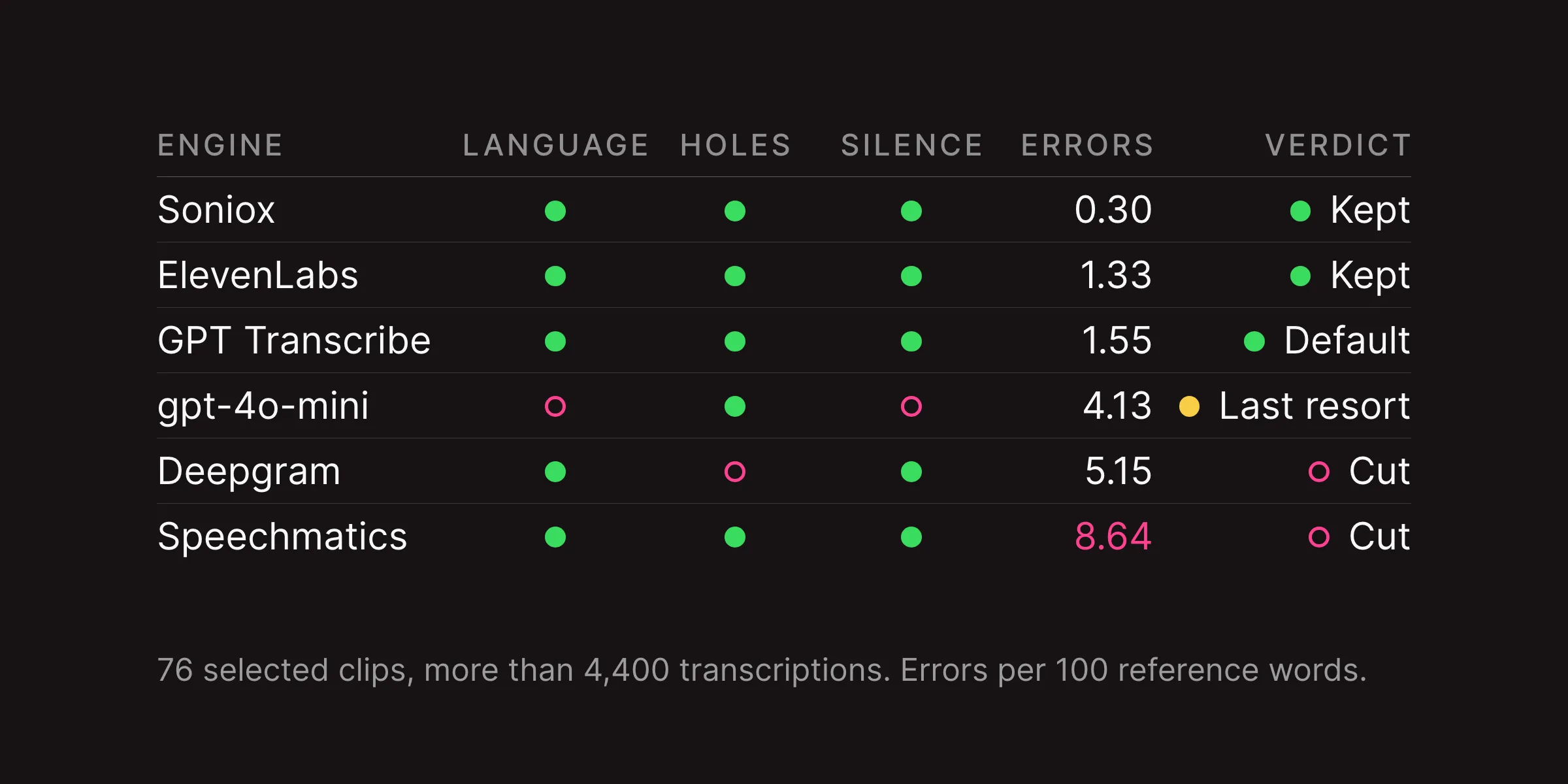
I asked agents to study roughly twenty contemporary blogs and our company site, Rebbix. The reading lines in the long-form examples clustered around 62 to 76 characters; Rebbix ran about 85. I wanted its dramatic chapter backgrounds in a format that would also be comfortable through a long technical article.
The first two design directions separated those instincts. A had a long dark header and an image crossing into the next background. B put the article into a lighter editorial frame, with a clearer header structure. Neither became the whole design.


We took the chapter backgrounds and bridge from A, then brought B's header structure onto the dark ground. The text kept its narrower reading column while figures could spread out.
The result was a fixed frame around flexible blocks: a header, a body we could compose, and an ending with a purpose. The microphone at the top of this page is that crossing image: one object standing in two backgrounds, so you notice the change without a line or a box.
Six charts, three renderers
The chart requests looked like a job for a charting library. Apache ECharts and Vega-Lite are powerful tools; I wanted to know how much work it would take to make our charts fit our page.
We took six real examples from the briefs and drew each three ways: with ECharts, with Vega-Lite, and with an SVG recipe an agent wrote for the test. The data, colours and type rules stayed the same, at both a reading-column width and a phone width.
On the phone, ECharts squeezed the long-recording plot into a sliver. Vega-Lite left almost no plot beside an axis label reading 1,500.000000. Our recipe moved the labels above the rows and kept room for the data.

ECharts needed two to four chart-specific adjustments per example. Vega-Lite needed workarounds too, and some layouts still broke our type rules. Our recipe kept all six charts in theme at both widths on the first pass.
As with the blog itself, building a renderer for our needs looked like less work and cost than adapting a general one. The agent supplies the data and names; our renderer owns the colours, type, sizes and layout, inside a common chart frame. When an article later needed sound on a time axis, we added it to that renderer. The server sends each vector chart with its caption and data table already in the page, so readers and search crawlers can reach the evidence.
The timeline that lived 19 hours
Timeline was the first chart kind we shipped, built to show speech missing from the middle of a recording. About nineteen hours later, it was gone as a separate kind. Its drawing had worked; we had found a structure that could cover much more.
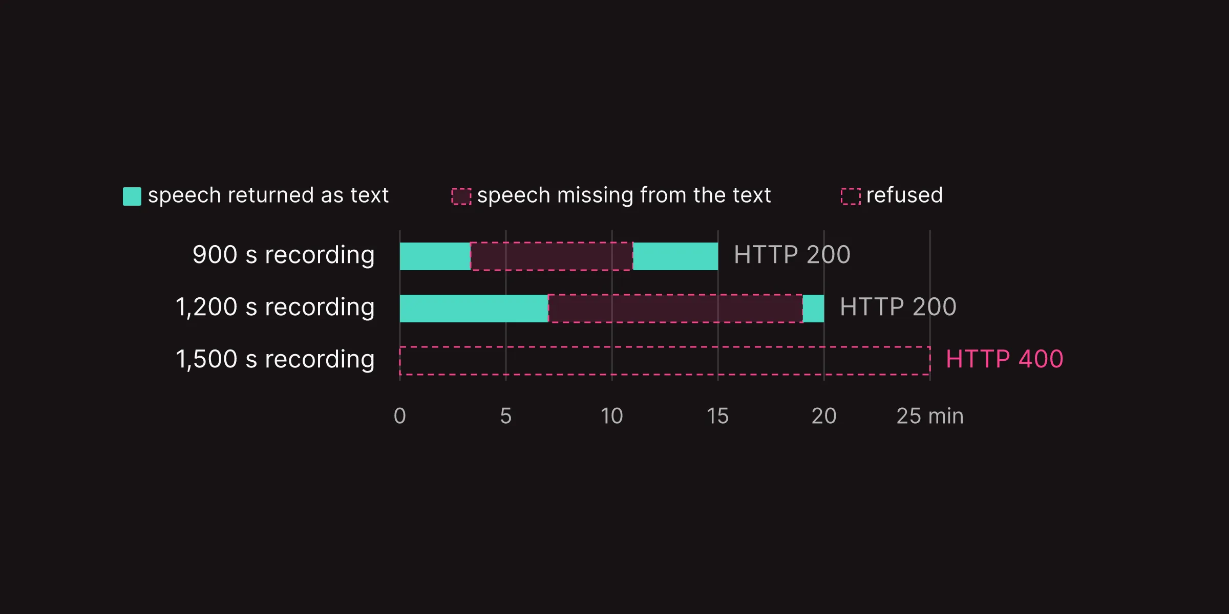
The missing middle, and the refusal that did announce itself
Three gpt-4o-mini tests from the speech-engine article; recording length in minutes
The first two returned HTTP 200 despite the gaps. The third refused the file outright. The speech-engine tests
The lengths, gaps and replies
| Recording | Missing interval | Answer |
|---|---|---|
| 900 s | 200-660 s | HTTP 200 |
| 1,200 s | 420-1,140 s | HTTP 200 |
| 1,500 s | file refused | HTTP 400 |
Across the agents' requests, the same layout kept appearing. Categories ran down the left, grouped when needed. One shared scale ran across. Each row could hold a bar, a before-and-after pair, a range or spans with a gap. Seconds, dollars and percent changed the unit, not the structure.
About half of the chart requests in the briefs fitted that layout, and timeline's job moved into it with them.
On each row it can draw:
- A bar, with a lighter tail for a second figure.
- Spans in states, with gaps where something is missing.
- A refusal, a dot with its range, or a before-and-after pair.
- Events, plus zones and reference lines across every row.
Bars, spans, dots, pairs and events on one axis
Invented values to demonstrate the renderer
The zone from 4 to 6 and the reference line at 9 run across every row. These are illustrative values, not measurements.
The illustrative values
| Row | Mark | Values |
|---|---|---|
| A bar | bar | 6 |
| A bar with a tail | bar and tail | 4 to 7 |
| Spans with a gap | spans | 0-3, gap 3-5.5, 5.5-8.5 |
| A refusal | refusal | to 7 |
| A dot and its range | dot and whiskers | 5, from 3.5 to 7.5 |
| Before and after | pair | 2.5 → 6.5 |
| Two events | events | 2 and 8 |
The catalogue mockup had seventeen chart names. The engine ended up with three families: rows on one axis, series against two axes, and sound on a time axis. An article still asks for the picture it needs; the engine has fewer ways to draw it.
A price question needed two axes
The same article had another question: which speech engine cost less for a particular dictation? Price per audio hour could not answer it alone. Soniox billed for the terms sent with each request, so the answer depended on both recording length and dictionary size.
The brief proposed two sliders and a live calculator. I chose a chart: the price as the term list grows, with two lines for Soniox at different request lengths and GPT Transcribe's rate for comparison.
Where Soniox crosses GPT Transcribe's rate as the dictionary grows
Per hour of audio at 12 s and 25 s requests; September 2026 billing
Soniox's lines are modelled from usage logs; the others are flat measured rates. The speech-engine comparison
The cost of an hour of audio, in dollars
| Engine | 0 terms | 10 terms | 25 terms | 50 terms | 100 terms | Soniox dearer past, 12 s / 25 s |
|---|---|---|---|---|---|---|
| Soniox, 12 s | 0.122 | 0.192 | 0.266 | 0.388 | 0.633 | - |
| Soniox, 25 s | 0.113 | 0.147 | 0.183 | 0.241 | 0.359 | - |
| GPT Transcribe | 0.277 | 0.277 | 0.277 | 0.277 | 0.277 | 27 / 65 terms |
| ElevenLabs, with a list | 0.263 | 0.263 | 0.263 | 0.263 | 0.263 | 24 / 59 |
| ElevenLabs, no list | 0.220 | 0.220 | 0.220 | 0.220 | 0.220 | 16 / 41 |
Follow the two pink lines. The shorter requests cross the fixed rate sooner: sending the same term list more often costs more. The picture shows why a single price per hour was not enough.
XY became our second chart family: different marks sharing the same two axes.
It can combine:
- Lines and the ranges around them.
- Separate points, with arrows from before to after.
- Columns, grouped or stacked, including values below zero.
Lines, points, columns and change on one chart
Invented values to demonstrate the renderer
- 1Columns stacked from two parts
- 2One thing, before and after
- 3A line with its range around it
- 1Columns stacked from two parts
- 2One thing, before and after
- 3A line with its range around it
- 1Columns stacked from two parts
- 2One thing, before and after
- 3A line with its range around it
These are illustrative values, not measurements.
The illustrative values
| Mark | Days, June | Values |
|---|---|---|
| Line | 1-30 | 5.4 rising to 8.5 |
| Range | 1-30 | the line ± 1.2 |
| Points, set 1 | 30 points, 1-30 | 4.8-9.9 |
| Points, set 2 | 30 points, 1-30 | 4.5-8.8 |
| Stacked columns | 3, 8, 13 | 2.5 + 1.5, 2 + 1, 3 + 1.2 |
| Before → after | 18 → 22 | 1 → 3.8 |
This family took about two hours of planning and another three to four hours of agent work, as I remember it. We could compose these combinations in our own style, without designing each as a separate chart type.
Make sound visible
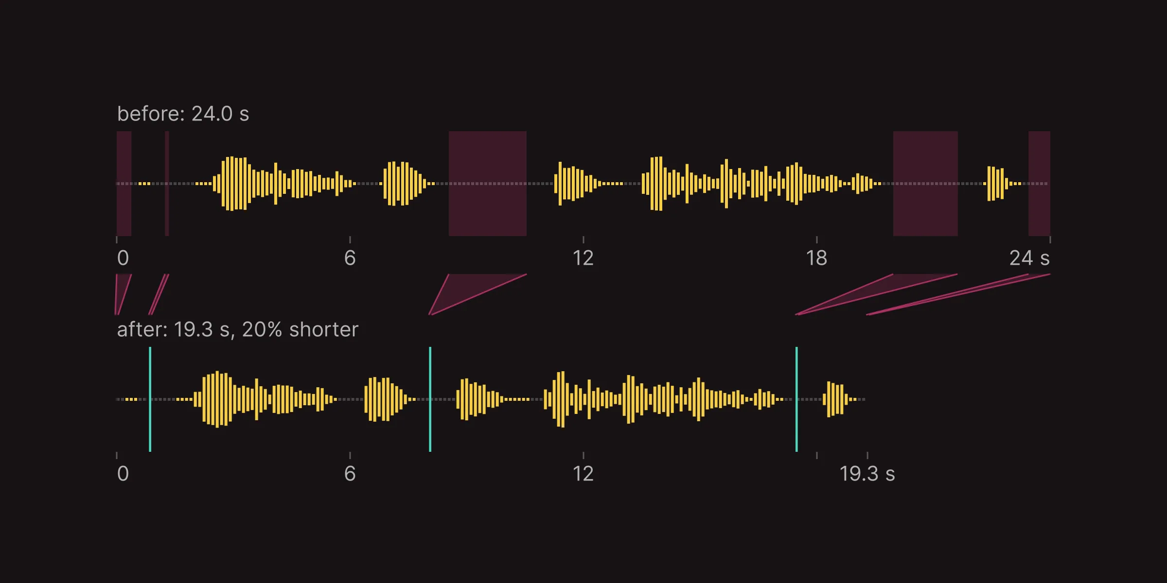
The silence-trim brief asked for removed regions falling away like cut film. The third chart family, sound, could show the original recording and a shorter copy at the same scale. On dark, its voice bars are gold, like Shepit's on-screen recording indicator.
One dictation before and after silence trimming, on one scale
A real 24 s recording; pink regions removed, with the shorter copy below
What was removed
| Removed interval, s | Removed, s |
|---|---|
| 0.00-0.38 | 0.38 |
| 1.24-1.34 | 0.10 |
| 8.54-10.54 | 2.00 |
| 19.96-21.62 | 1.66 |
| 23.44-24.00 | 0.56 |
| Total | 4.70 |
This is a real 24-second dictation of mine. The pink bands are what the trimmer removes. Under the axis, the same recording appears without those regions and stops at 19.3 seconds. The film shows where the seconds came from.
I had cut the spectrogram as overkill when the catalogue held too many candidates to judge. But the noisy-room brief had a precise question: where did the room's rumble live beneath the voice? I brought it back as a lane under the waveform, on the same time axis. Here is a seven-second window from a different recording, before and after a filter.
Where the room's rumble lives, before and after a 100 Hz high-pass
Seven seconds of a real dictation: time across, frequency up, brightness the energy
- 1No speech here: the stripe stays
- 1No speech here: the stripe stays
- 1No speech here: the stripe stays
- 2where the app listens
- 3100 Hz high-pass
Measurements over the full recording, about 60 s
| Measure | As recorded | After the 100 Hz high-pass |
|---|---|---|
| Loudest band | 53 Hz, -19.88 dBFS | 85 Hz, -29.25 dBFS |
| Gate floor in the voice band, int16 RMS | 50.18 | 47.34, about 0.5 dB lower |
These two examples use measurements from my recordings: the blog engine receives the numbers, not the audio, and the agent chooses the clip and the window to show.
Three ways to make a cover
From the article
An article already has things worth pulling out: a chart, a highlight, a key number. Our engine can turn those accents into covers. Here are the options it made for this article, alongside its category default.



Defaults with variety
Fable proposed six designs, one for each category. The engine varies them using an article's address. Even when we choose no custom cover, the article list has colour and variety.




The microphone design below is one pattern, drawn for four different article addresses.



Drawn for one article
For a cover beyond those options, I can ask an agent to work with Fable: take this accent from the article and make something with it. The first article's cover, in the next section, came from that route.
The chosen cover appears on the blog card, the author's page and the share image.
By the fourth working day
The first speech-engine article went live on 4 October. It had real blocks and rows charts, on a page I could edit through agents, in our own design.
From the first decisions to a live article
Calendar milestones, including weekend breaks; the chart families kept growing after first publication
Tracks run from each area's first to last release milestone, including breaks; dates do not measure hours worked.
The release milestones
| Milestone | Kyiv time | Kind |
|---|---|---|
| Roles and sign-in | 29 Sep 18:13 | code merge |
| Content store and editing tools | 30 Sep 05:22 | code merge |
| Plain public pages | 30 Sep 10:52 | code merge |
| Editorial workflow | 1 Oct 18:10 | code merge |
| Timeline chart | 1 Oct 21:00 | code merge |
| Rows replaces timeline | 2 Oct 16:18 | code merge |
| List, author pages, covers | 4 Oct 01:28 | code merge |
| First article live | 4 Oct 12:32 | publication |
| Search and feeds | 4 Oct 16:38 | code merge |
| xy chart | 4 Oct 17:43 | code merge |
| Price chart replaces its placeholder | 4 Oct 20:10 | article draft |
| Price chart live in the article | 5 Oct 17:04 | publication |
| Sound, with the spectrum lane | 5 Oct 23:50 | code merge |
Work continued that evening: the two-axis chart replaced its price placeholder. That chart went live with the next day's revision, and the sound family joined the engine that day too.
The speech-engine, silence-trim and long-dictation articles are live. The engine has article pages, the blog list, author pages and cover tools. New components go straight into the agents' editing tools.
Only now do I see that we built more than a blog. With the same blocks and a little more work on the engine, we can build any custom landing page on our site. Our marketing team could build those pages themselves: working with their own agent on the messages and angles that bring people to Shepit, they would publish through the same MCP server, with no coding skills and no access to the repository.
This article asked for a grid
This article needed one more block. I wanted readers to compare its cover options, the category defaults and variations of one pattern side by side. The covers belonged in grids, where their differences would be visible at a glance.
So we added an image grid to the blog engine. Planning it with an agent took about half an hour. Fable's visualisations were good on the first pass; I had no changes. Opus implemented it in about two hours.
In two to three hours, we had a new block the agents could use in any article through our editing tools. Owning the blog made the addition possible; working with agents made it this quick.
This page is built from the engine's parts, and it added one of its own. I needed a blog, and building exactly the one I wanted was faster and simpler than adapting someone else's. It came out fucking awesome.
Personal software, built on demand for exactly what you need. The future is already here.